



Walk into a lot of small church board meetings and you'll find a stack of printouts nobody actually reads. There's the giving report from the accountant, an attendance count someone jotted down after service, a facilities update that's really just a list of things that broke, and maybe a volunteer roster nobody has looked at since October.
The board members — usually a retired accountant, a schoolteacher, a small business owner, and a couple of longtime members — spend the first twenty minutes trying to figure out what any of it means. By the time they get to actual decisions, half the meeting is gone and everyone's tired.
Why most church board reports drown people in numbers they don't understand
Walk into a lot of small church board meetings and you'll find a stack of printouts nobody actually reads. There's the giving report from the accountant, an attendance count someone jotted down after service, a facilities update that's really just a list of things that broke, and maybe a volunteer roster nobody has looked at since October.
The board members — usually a retired accountant, a schoolteacher, a small business owner, and a couple of longtime members — spend the first twenty minutes trying to figure out what any of it means. By the time they get to actual decisions, half the meeting is gone and everyone's tired.
The problem isn't a lack of data. Most churches have more data than they know what to do with. The problem is that nobody has translated it into something a non-technical volunteer board member can absorb in one sitting — what changed, why it matters, and what they're being asked to decide.
That's the whole job of a good board dashboard. Not to show everything. To show the right handful of things, framed so a busy volunteer can get through it in the time it takes to drink a cup of coffee.
The core mistake: treating the board like operators
This pattern shows up constantly. Staff build the board report the same way they'd build their own internal tracking — line items, weekly breakdowns, every ministry's numbers. Because to the staff, that level of detail feels responsible. Like they're being transparent.
Simplify your church’s day-to-day operations.
Parshly helps you organize events, track donations, and engage your congregation—all in one place.
- Centralized member management
- Donation tracking & reporting
- Volunteer scheduling & notifications
No credit card required
But board members don't run the day-to-day. They govern. Their questions are different:
-
Are we financially healthy or heading toward trouble?
-
Is the church growing, holding steady, or quietly shrinking?
-
Are there risks we need to know about before they blow up?
-
What are you asking us to approve or fund?
A twelve-page operational report answers none of those questions cleanly. It buries them. A board member reading it either checks out entirely or fixates on something random ("why did the coffee budget go up?") and derails the meeting on something trivial.
The fix isn't more explaining. It's fewer numbers, chosen deliberately, wrapped in a short narrative.
The minimal KPI set: pick 6 to 8, not 30
Boards that actually function well tend to track a tight set of indicators — usually somewhere between six and eight. Enough to cover health, growth, and risk. Few enough that each one earns its place.
Here's a starting set that works for most churches under a few hundred members. Adjust the names to fit your context.
| KPI | What it tells the board | How often to report |
|---|---|---|
| Weekly giving vs. budget | Whether income is tracking to plan | Monthly, with trend |
| Cash on hand (months of runway) | How long you could operate if giving stopped | Monthly |
| Average weekend attendance | Direction of overall engagement | Monthly, rolling 3-month average |
| New givers / lapsed givers | Health of the giving base, not just the total | Quarterly |
| First-time visitors + return rate | Whether outreach is actually landing | Monthly |
| Active volunteers vs. roles needed | Capacity and burnout risk | Quarterly |
| Restricted vs. unrestricted funds | Whether "cash" is actually spendable | Monthly |
| One risk indicator (rotating) | Facilities, staffing, compliance — whatever's live | As needed |
A few notes on why these and not others.
Total giving alone lies to you. A church can post a record giving month while quietly losing its base — because two big year-end gifts masked twenty families who quietly stopped. That's why new vs. lapsed givers matters more than the headline number. The trend in the base predicts next year; the total only describes last month.
"Cash in the bank" is not the same as runway. A board sees $80k and relaxes. But if $55k of that is restricted — building fund, missions, memorial gifts — the church actually has about three weeks of operating money. Splitting restricted from unrestricted is one of the single most clarifying things you can put in front of a board. It changes the whole tone of a budget conversation.
Attendance needs a rolling average. One rainy Sunday or one holiday weekend makes a single-week number meaningless. A three-month rolling average shows actual direction and stops the board from panicking or celebrating over noise.
The part everyone skips: the narrative
A dashboard full of numbers still isn't a board report. The numbers tell you what. Board members need why it matters and what to do. That's the narrative layer, and it's the difference between a report that informs and one that just sits there.
The format is dead simple. For each KPI that moved meaningfully, write three short lines:
-
What changed — the number and the direction, in plain language.
-
Why it matters — the implication for the church.
-
Recommended action — what you want the board to do, decide, or watch.
> Weekly giving is running about 8% below budget for the last two months. > Why it matters: At this pace we'd end the year roughly $22k–$26k short of plan, which would eat into our reserve. > Recommended action: No decision needed yet. We're launching a quiet re-engagement effort with lapsed givers and will report back in 60 days. Flagging now so it's not a surprise later.
Notice what that does. It gives the board a number, an interpretation, and a clear statement of whether they need to act. Half the time the recommended action is "nothing, just be aware." That's fine. Saying so explicitly is what keeps the meeting calm and focused.
The mistake is writing narrative that hedges everything. "Giving is a little soft but could recover, hard to say." That tells the board nothing and forces them to interpret raw data anyway. Take a position. You can be wrong; you just can't be vague.
A workflow for building the monthly report without it eating a day
The reason board reports stay bad is that building them is painful, so staff do the minimum. Here's a sequence that keeps it under a couple of hours once your data lives in one place.
-
Pull the four financial numbers first — giving vs. budget, cash on hand, restricted split, and month's expenses. These are objective and don't require interpretation to gather.
-
Update the rolling averages for attendance and visitor return. Don't report the raw week; report the trend.
-
Check the two "base health" metrics — new vs. lapsed givers, active volunteers vs. needed. These are the early-warning ones.
-
Identify what actually moved. Ignore anything that changed by less than a meaningful amount. Stable is not news.
-
Write the three-line narrative only for what moved. If a KPI is flat and healthy, one word — "stable" — is enough.
-
Add the one rotating risk item if there's something live
an expiring insurance policy, a staff transition, a boiler on its last legs.
The trap is step four. Staff feel obligated to comment on everything, so the report balloons and the signal gets lost. A good board report is mostly quiet. It draws attention to the two or three things that genuinely need it.
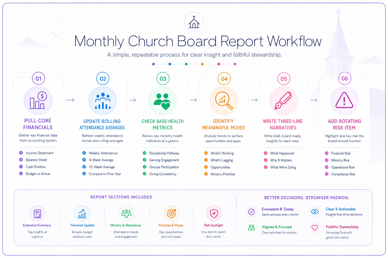
Keep the sequence consistent each month and the work time drops dramatically as the inputs centralize.
Where the data actually comes from — and why fragmentation kills this
The honest operational barrier is this: most churches can't produce this report cleanly because the numbers live in four different places. Giving is in one system, attendance is on a clipboard, visitor data is in someone's email, and volunteer rosters are in a spreadsheet only one person can edit.
Building the monthly dashboard becomes a scavenger hunt. Someone spends Saturday morning copying figures between tabs, and by the time it's assembled, half of it is a week out of date. That friction is exactly why board reports get skipped or thrown together in the parking lot before the meeting.
Prioritize connecting giving and member records first — that usually unlocks most of the repeatable reports you need.
Centralizing your operational data — giving, attendance, membership, and volunteers in one connected platform — quietly changes everything. Not because dashboards are magic, but because when giving records and member records live in the same system, the trend lines start assembling themselves. New-vs-lapsed givers becomes a simple query, not a Saturday project. Rolling attendance averages update on their own. The reporting stops depending on one exhausted volunteer's spreadsheet skills.
AI-assisted church management platforms take this further by automating the pulling and grouping of recurring data points, so the person building the report isn't also hunting for the inputs. A narrative dashboard is only sustainable if the underlying numbers are easy to pull. Fix the data plumbing and the monthly report goes from a dreaded chore to a fifteen-minute review of something mostly already built.
A real scenario: a 180-member church that fixed its board meetings
A congregation of roughly 180 regular attenders had a board that met monthly and, by the treasurer's own admission, spent most of each meeting confused. Reports were a mix of a bank statement printout, a handwritten attendance figure, and whatever the pastor remembered about volunteers.
The recurring problem: the board kept getting blindsided. They'd approve a budget in spring, then discover in the fall that giving had been drifting down for months and nobody had flagged it. Two years running, they had to make rushed year-end appeals that felt panicked to the congregation.
They cut their report down to seven KPIs and adopted the three-line narrative format. The first month it revealed something the old reports had hidden completely: unrestricted cash was down to about six weeks of runway because a large gift everyone was counting on had been designated for the building fund.
Because it surfaced early — with a clear recommended action attached — the board made a calm decision to pause a planned hire for one quarter rather than scramble later. Over the following year, meetings that used to run close to two hours settled into about 50–60 minutes, and the "why didn't anyone tell us" moments largely stopped. The reports weren't longer. They were shorter. They just pointed at the right things.
When this makes sense — and when it doesn't
This is worth doing if your board is made up of volunteers who don't work in the church day-to-day, your meetings routinely run long or get derailed, or you've been surprised by a financial or attendance trend that had been building for months. Those are the exact conditions a narrative dashboard is designed to fix.
This is overkill if you're a tiny church where the board is basically the same three people who run everything anyway. If governance and operations are the same handful of hands, a formal board dashboard adds ceremony without adding clarity. A quick conversation does the job.
Who should not do this: anyone tempted to turn the minimal set back into a maximal one. If your first instinct is "but we should also track social media reach, and small group counts, and the missions committee's sub-budgets" — resist. The entire value here is restraint. Every KPI you add past eight or so costs you attention on the ones that actually matter.
The one habit that makes it stick
The format only works if it stays honest. When a number is bad, the temptation is to soften the narrative or quietly drop that KPI for the month. Don't. The board's trust comes from consistency — same metrics, same format, every month, good news or bad. A dashboard that only shows up when things look good stops being useful the moment things get hard, which is exactly when the board needs it most.
Start with the six-to-eight set above. Write three lines for whatever moved. Keep the rest quiet. Do it the same way every month. Within a quarter, your board meetings will feel less like archaeology and more like actual governance — which is the whole point.
The format only works if it stays honest. When a number is bad, the temptation is to soften the narrative or quietly drop that KPI for the month. Don't. The board's trust comes from consistency — same metrics, same format, every month, good news or bad. A dashboard that only shows up when things look good stops being useful the moment things get hard, which is exactly when the board needs it most.
Start with the six-to-eight set above. Write three lines for whatever moved. Keep the rest quiet. Do it the same way every month. Within a quarter, your board meetings will feel less like archaeology and more like actual governance — which is the whole point.
Ready to transform your church management?
Join 500+ churches using Parshly to enhance community engagement, streamline administration, and grow their ministries.